We are very proud about our new diagram called "Glucose - Comparison of days - Heat map". In this diagram the little fluctuation of the blood glucose will be represented in little fluctuations of colors. This way the little improvements over time can be experienced visually. We hope that this will give some positive feedback for those who have to invest their effords in many small steps to finally reach better control.
Now an example how the new heat map will look like. This represents one year of my life. The quality of blood glucose for 365 days represented in colors:
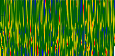
Relation between Color and Blood Glucose
mmol/l (left) and mg/dl (right):
